Make it Monday #320
Spot Color Word Diecuts
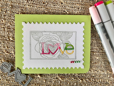

Spot Color Word Diecuts
This week's challenge from Betsy Veldman on the PTI blog
is a new technique for me. I noticed that it makes a difference seeing the diecut word when it is "fatter" and the ink stamping lighter. I used the rose image from Botanical Blocks and the die from Wonderful Words: Love. It's a fun effect!
Card Supplies:
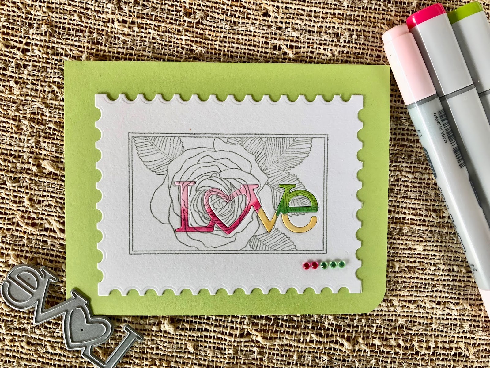
Stamp: PTI Botanical Blocks
Dies: PTI Mix & Mat: Postal, Wonderful Words: Love
PTI Green Parakeet card stock, Ranger Water color paper
Copic markers and SSS rhinestones

This is the best example I've seen; I like it better than Betsy's!
ReplyDeleteOh wow--this came out great! I agree--better than Betsy's!
ReplyDeleteOh yeah!! I'm with Karen and Greta!! this is over the top great. The best I've seen for this challenge : )
ReplyDeleteVikki, this card is marvelous! I love the colors you chose, and the postage stamp edges!
ReplyDeleteWonderful use of the challenge technique. Love that you just colored the word, didn't worry about the stamped lines. I actually had this stamp out, but couldn't figure out how to make it work. Your's is brilliant.
ReplyDeleteVikki, this looks like a postage stamp...perfect for wedding/anniversary cards or invites. Love the softer ink used for line images as I find mine and others hard to read (even Betsy’s). Super job!
ReplyDelete