Showing posts with label Color Hues. Show all posts

Monday, April 18, 2022

Happy Birthday ala Purples

 Hey, it's been a long, long time since I dropped a card on the blog. Today my Instagram post would not link up with the Color Hues Challenge of Purple and Green.

I cut parts of three Honey Bee Lovely Layers: Anemone in several shades of purple card stocks including glimmer and glitter types. I had not made a mini slimline in a while so arranged the blooms vertically, spilling over some edges, and trimming the edges afterwards. A die cut sentiment from Altenew's Sentiment Strips was added in black with white backing. 


Check out more entries on the Color Hues Challenge!

I also tagged this on IG for the Simon Says Stamp IG Challenge!

Monday, June 21, 2021

Color Hues - Aqua and Black

As soon as I saw Karen W's design team entry for the current Color Hues challenge, I knew exactly what stamps to use for the color combo. I've not purchased many MFT products but the Brilliant Butterflies set recently lured me to their store. It's an ideal set for two color themes and hopefully my card will inspire you to create something for this challenge.


I used another new purchase, the mini slim line die set bundle from Pink Fresh Studio. This is an ideal size in my opinion and even fits in a standard sized envelope. The happy sentiment is an older PTI die cut from black sparkly fun foam. A trio of iridescent stars finishes the card.


Here's a second card in A2 size which suits this larger butterfly. 

                                                 
Nordic Frame die cut panel (The Greetery)
Life is Beautiful sentiment (PTI) 

As the photos show another card is in the works using die cuts supplied by my friend Greta.                    

Tuesday, January 12, 2021

Happy New Year a few days late!

Welcome to 2021 friends! Confession: I'm a very lazy blogger. I've viewed many of your blogs and have spent a lot of time on Instagram at vikkispapertrailetc the past couple of months as it is easier to post. The mail carriers have been kind to me with new products and new supplies of ink and glue to reinforce my stash.  Next week marks the end of our first year in Portland. We're grateful to live in a walking neighborhood after 40 years on a rural hilltop. It has made the difference in my outlook in this quarantine life. As a natural introvert it has been important to see people daily walking to and fro living the best they can in these circumstances.

I alluded to new items and the two cards in this post feature one of them, the Altenew Hanging Garden dies. My cards use the positive and negative parts of the die in an inlay technique with the additional touch of red to brighten the neutral gray and white. The Color Hues Jan. 1-14 challenge to use gray and red determined the colors of my paper and ink. The two grays vary in their cool and warm tones but work together, I think.

Card #1

Card #1 begins with a side folding PTI Weathervane gray card stock splattered with white. Textured gray woodgrain paper and a white panel were each die cut with the larger die. The positive parts of this process were inlayed in the opposite negative panel. The berry portion of the die was cut twice from red linen paper. The encouraging red sentiment is from a PFS Partial Cut Floral Frame set from 2019's SS Stamptember. A thin red strip on the left finishes the triangle of red areas on the card.
 
Card #2 

My second card uses a PTI soft stone card front and the gray woodgrain panel finished with the largest SSS stitched rectangle. A PTI Enclosed: Wreath's sentiment, Peace, die cut in red and embellished with Wink of Stella clear finishes this one. The texture is so pretty. Christmas card #1 done for the year. I almost wished that it was turned horizontally with the sentiment in another corner.


Both cards are linked to three challenges: 

Thanks for your visit and again, Happy New Year! 

Tuesday, December 1, 2020

Color Hues: TCH #7


Happy holidays on the first of December! I'm delighted to join the Color Hues 7th challenge today as the guest designer. This bi-monthly challenge focuses on a two color palette in your card design. 


The two colors selected this session work well
 for winter themes, don't you agree?


Card #1


My first card sparkles with starry blue holographic paper on one ornament and magenta shimmer paper decorating the second. The blue ball dangles via a scored line from the pine needles. Both ornaments and pine spray were directly glued on a die cut panel which was then adhered to a top-folding white card front. 

Card Menu: Nordic Frames die (The Greetery)
Pine Needle Trio dies (SSS)
What the Doodle: Ornament die (PTI) first time to use this one
December Typed Words (PTI)


Card #2

I hate to discard negative die cuts especially when they serendipitously all line up. After a trim the white rectangle was directly glued to a blue panel to create the blue needles. The winter sentiment will let me use this for Christmas or other occasions.

Card Menu:
Pine Needle Trio dies (SSS)
an old HA monthly kit sentiment
vellum banner (The Greetery)


The Color Hues team have beautiful ideas that you can see on the blog. They would love for you to play along with their new challenge.

My cards are also linked to the SSSW challenge: Anything Goes
Thank you for your visit!


Wednesday, November 4, 2020

Color Hues #5: Yellow & Kraft


Pleased to join the Color Hues #5 challenge this month with an old favorite, Botanical Blocks (PTI). The block was stamped first with DI frayed burlap and again with VersaMark embossing ink and clear embossed. Then using the pictured Distress Inks the image and background was colored using a watercolor brush. A Pierced Feature Frame (PTI) frames the rectangle which was layered three times and adhered to a soft yellow card front. I decided not to add a sentiment for now but have a birthday in mind.  


Thank you for the visit!

Tuesday, September 22, 2020

Blessed

Good morning! Here's my card today made after many minutes of gluing fine lines of the navy outline and filling in the details with blue and turquoise leaves. Due to an accidental ink spot on the background the entire project was splattered with more color! Ha ha for CAS - not.


The NBUS Leafy Envelope (PFS) was die cut from watercolor paper and all the pieces fell out.  I gently ink blended HA Navy ink over the outline and glued it to a white panel. Next the large leaves sections were colored with copic markers and inlaid in the appropriate spots. The other leaves were left unfilled but colored again with copics.  I masked the envelope area and splattered ink around the area. The panel was placed on an aqua-turquoise card front. My friend Greta kindly shared the PTI Blessed die cuts a while ago and this statement touched my heart. In this pandemic time I've been blessed by old friends and new acquaintances found on card blogs sending "thinking of you" and "hello" cards. Thank you all.

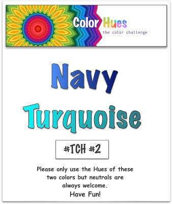
Card linked to Color Hues TCH #2 , SSSW: No Stamps Allowed, and NBUS


Today would have been my dad's 94th birthday. We surprised him on his final birthday 40 years ago so that he could meet his youngest grandson, six months old then. Little did we know he would die from a stroke five months later. I was loved and blessed by him.


Friday, September 18, 2020

September SSS Card Kit Group

With all of the smoke in the air keeping us inside, I finally opened the SSS September card kit box this week.  So far I've made five cards. I usually prefer plain backgrounds for my cards but with all the pretty pattern papers included in the kit, I put aside my preferences. FYI, the fires are mostly in the mountains and river canyons in Oregon but not in Portland.

The first two cards feature the wonderful sentiment die included with the kit. I used green vellum for the shadow sentiment on the first card and yellow vellum laid over white card stock on the second. I fussy cut a yellow flower and popped it up as a center for the orange flower. The entire panel was trimmed with a SSS Wonky Rectangles die.


The sunglasses card reminds me of a postcard you might send to someone saying "wish you were here".  The panel edges were finished with a SSS Stitched Rectangle die. The card front was textured with a PTI linen impression cover plate before the panel was added. 

Both of these cards will be linked to the SSSW Challenge: No Stamps Allowed


The next two cards share the same background paper with the positive and negative images of a PTI United States die. The first card used a sentiment from the kit embossed in gold and hearts stamped in aqua. It's companion card has a sentiment from PTI's These United States and an extra "Let's Explore" poster from the kit added.


I'm linking this card to NBUS #18. I had not used this kit until this week plus I had never used the USA die or its sentiment.


My fifth card again uses a background pattern paper from the kit in shades of navy, blue and cream. The kit provided the fussy cut clouds, heart balloon and sentiment. This card's colors were chosen for the new challenge, Color Hues TCH #2.


Thanks for your visit today! See you around the internet!